User Interfaces
This topic discusses the creation of graphical user interfaces in OPENRNDR applications.
The Panel library
The Panel library provides an HTML/CSS like user interface toolkit and is written using OPENRNDR.
Basic Usage
The easiest way to use Panel is to use it as a Program extension. When used as an extension all mouse and keyboard events are automatically handled and drawing of the user interface will take place after your program’s draw() has been invoked.
To create a very simple user interface that consists of just a single button one would do the following:
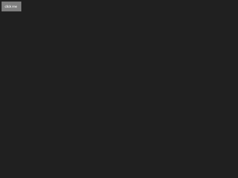
fun main() = application {
    program {
        var color = ColorRGBa.GRAY.shade(0.250)
        extend(ControlManager()) {
            layout {
                button {
                    label = "click me"
                    // -- listen to the click event
                    clicked {
                        color = ColorRGBa(Math.random(), Math.random(), Math.random())
                    }
                }
            }
        }
        extend {
            drawer.clear(color)
        }
    }
}
Style sheets
The Panel library borrows a lot of ideas from HTML/CSS based layout systems, one of those ideas is style sheets.
Style sheets can be used as shown in the following example in which a style sheet is used to color a button pink.
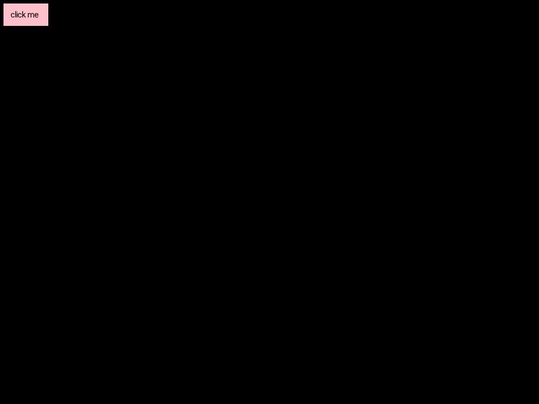
fun main() = application {
    program {
        extend(ControlManager()) {
            styleSheet(has type "button") {
                background = Color.RGBa(ColorRGBa.PINK)
                color = Color.RGBa(ColorRGBa.BLACK)
            }

            layout {
                button {
                    label = "click me"
                }
            }
        }
    }
}
Selectors
The following example shows how to build and use complex selectors
fun main() = application {
    program {
        styleSheet(has class_ "control-bar") {
            descendant(has type "button") {
                width = 100.percent
            }

            child(has type "slider") {
                width = 100.percent

                and(has state "hover") {
                    background = Color.RGBa(ColorRGBa.RED)
                }
            }
        }
    }
}
Elements
The Panel library comes with a built-in set of elements with which user interfaces can be composed.
Element
Element is the base class from which all other elements derive. Element can be used directly but it is advised to use Div instead.
Div
The Div represents a rectangular area in which other elements can be placed. The Div element is the main ingredient in the creation of layouts. Divs are best created using the div {} builder.
fun main() = application {
    program {
        controlManager {
            layout {
                div("some-class-here", "another-class-here") {// -- children here
                }
            }
        }
    }
}
Button
An ordinary labelled button. The default width of buttons is set to Auto such that the width is determined by the label contents.

fun main() = application {
    program {
        extend(ControlManager()) {
            layout {
                button {
                    label = "Click me "
                    events.clicked.listen {// -- do something with the clicked event
                    }
                }
            }
        }
        extend {
            drawer.clear(ColorRGBa.GRAY.shade(0.250))
        }
    }
}
Slider
A horizontal labelled slider control.
Properties
label : String- the slider labelprecision : Int- the number of digits behind the point, set to 0 for an integer sliderrange: Range- the slider range, default isRange(0.0, 10.0)value : Double- the slider value
Events
valueChanged- emitted when the slider value has changed

fun main() = application {
    program {
        extend(ControlManager()) {
            layout {
                slider {
                    label = "Slide me"
                    range = Range(0.0, 1.0)
                    value = 0.50
                    precision = 2
                    events.valueChanged.listen {
                        println("the new value is ${it.newValue}")
                    }
                }
            }
        }
    }
}
Since the value is clamped to the current range, it is better to set the range before the value to avoid unexpected results.
ColorPickerButton
A button like control that slides out a HSV color picker when clicked
Properties
label : String- the label on the buttonvalue : ColorRGBa- the currently picked color
Events
valueChanged- emitted when a color is picked

fun main() = application {
    program {
        extend(ControlManager()) {
            layout {

                colorpickerButton {
                    label = "Pick a color"
                    color = ColorRGBa.PINK
                    events.valueChanged.listen {
                        println("the new color is ${it.color}")
                    }
                }
            }
        }
    }
}
DropdownButton
A button like control that slides out a list of items when clicked.
Properties
label : String- the label on the buttonvalue : Item- the currently picked item
Events
valueChanged- emitted when an option is picked

fun main() = application {
    program {
        extend(ControlManager()) {
            layout {
                dropdownButton {
                    label = "Option"

                    item {
                        label = "Item 1"
                        events.picked.listen {
                            println("you picked item 1")
                        }
                    }

                    item {
                        label = "Item 2"
                        events.picked.listen {
                            println("you picked item 2")
                        }
                    }
                }
            }
        }
    }
}